I’m back with some quick tips to speed up your creative process and in turn I’ll teach you how to get more out of your digital scrapbooking stash.
Digital Collage
Lynn from
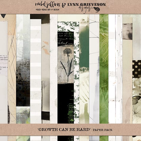
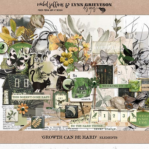
and I have released a new collection that’s themed around growth (and how that can be hard) plus it has a collage aesthetic.We have purposely included less dimensional elements and have experimented with a beautiful ephemera and artful collage style.
I have included some of my signature collage papers in this kit and I thought it would be fun to show you a few of my recent ‘hacks’ and the digital manipulations I am using frequently at the moment.
Advanced Masking Techniques
I’m going to explain a quick and easy way you can stretch your stash of ready made collage papers and how you can manipulate them powerfully.
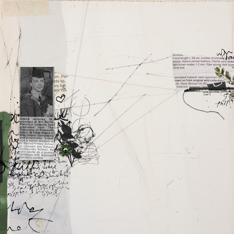
Let’s take my layout above as an example . . . how did I stamp my journaling under that green strip of paper without doing any harsh erasing or spending a long time hacking the ready made paper?!
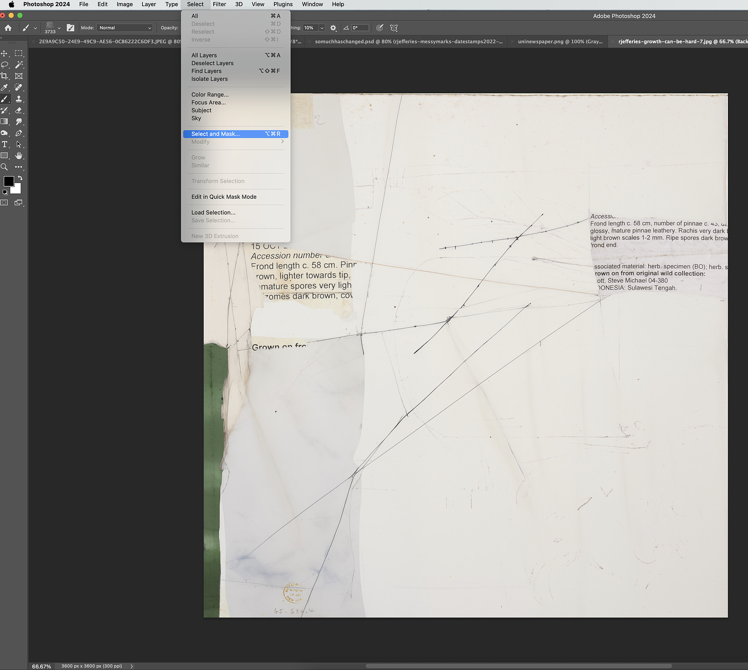
As with all techniques, and adobe software, there are many ways of doing things but for me, the secret sauce is in the ‘Select and Mask’ option when using Photoshop which is nestled about half way down the ‘Select’ menu.
It’s a fast way to ‘cut things up’ and will give you more control over manipulating and stretching your stash of digi supplies.
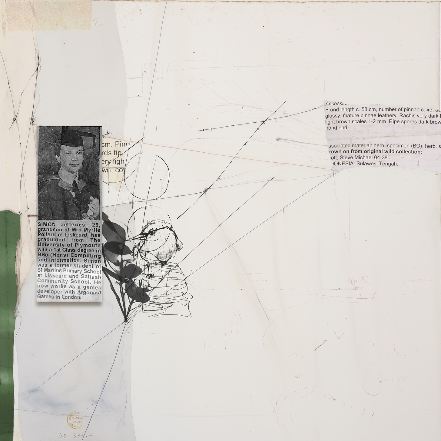
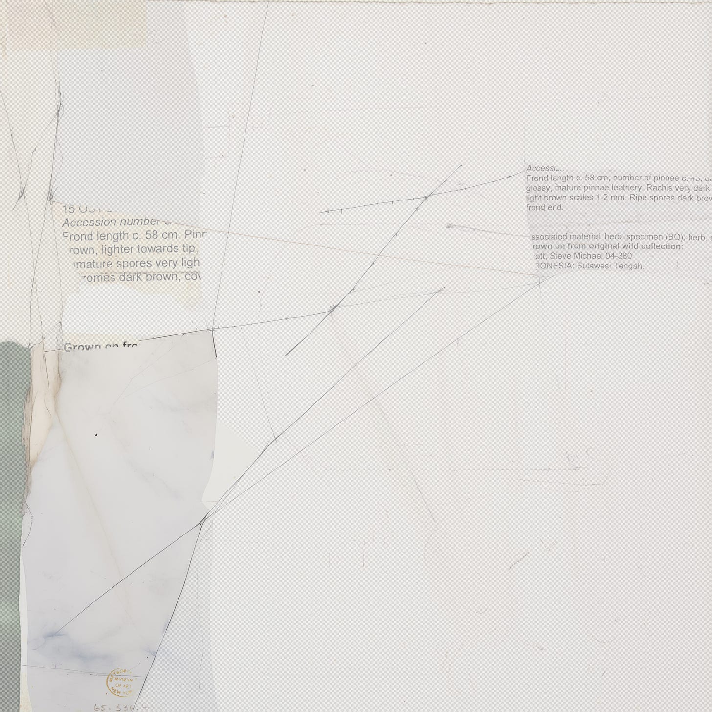
I have positioned my Photo in place, which is a newspaper clipping in this case, and I have already applied some gradient and show effects to it, popped a staple above it and added a digital stamp behind it and alongside it.
I have not made any edits to the background paper yet.
Next I scrawled my journaling on a piece of scrap paper and digitised it ready for my page.
See this article for steps about how to create a digital stamp from your journaling or sketches etc.
In past articles I have showed you how to create a stamp from your journaling and simply add it to your page. I’m going to do that today too, but I’m also going to use my journaling as a DESIGN ELEMENT
I created my stamp from a high resolution photograph so it’s super large, 3,781 pixels to be precise, so my text stamp is going to be very large when I stamp it which is really fun to use as design element.
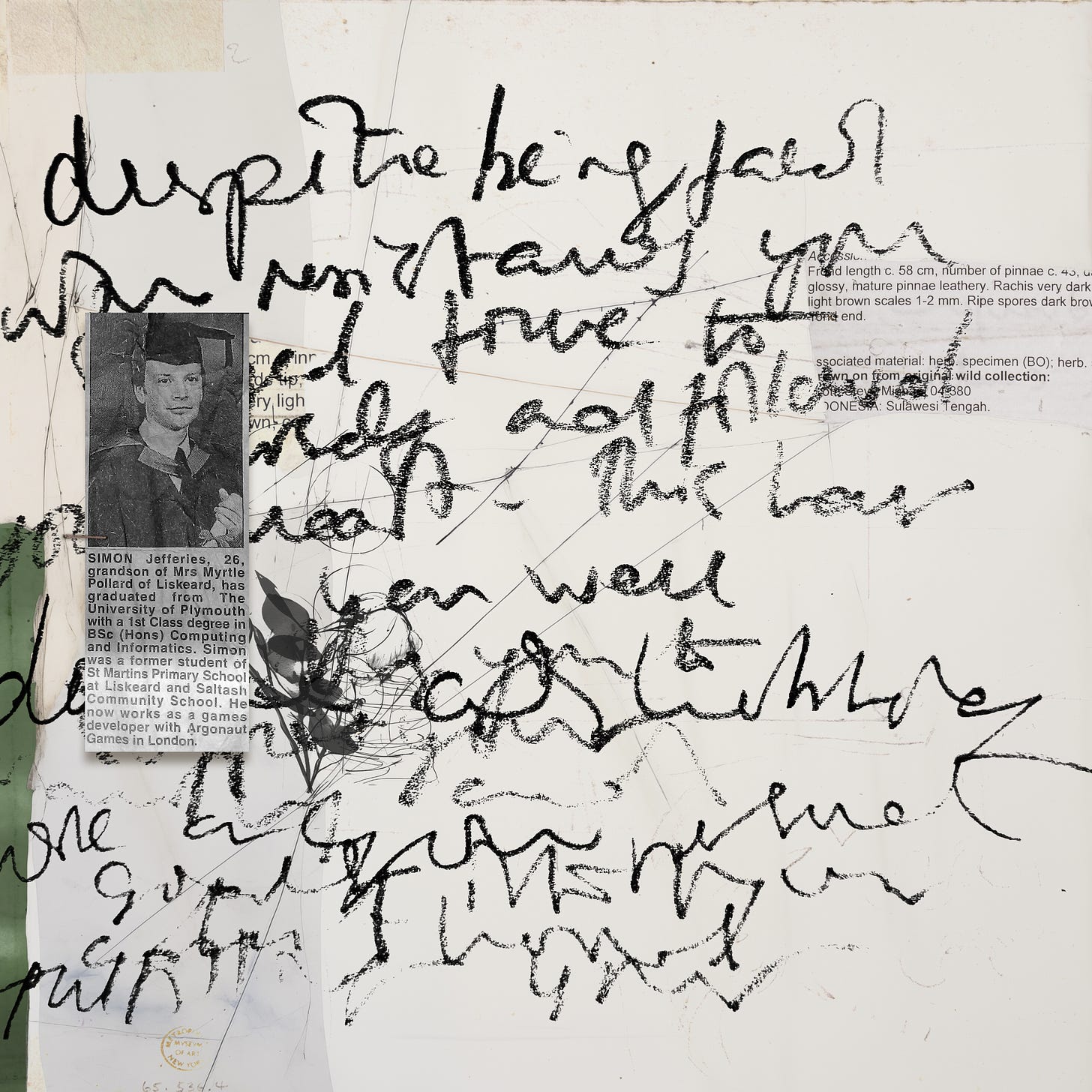
I stamped it on my background paper (on a new layer) to show you what it will look like.
Now I’m ready to use the ‘Select and Mask’ Tool and I’m going to cut out the piece of paper thats underneath my newspaper cutting that’s an off white so that I can ‘clip’ my large scrawly text stamp that I’ve created.
With your background paper active (select the layer with the paper in it within your layers toolbox) head to the ‘Select’ Menu and choose ‘Select and Mask’.
This will enable you to make a selection, and it will create a ‘mask’ (a copy) from your selection.
You will have the option of some different tools once you reach this point, I sometimes use the object selection tool but for this tutorial I’ll stick with the first option, the quick selection tool.
Once you select this you will be able to adjust the size of your brush if needed and I’m going to use the brush to highlight the rectangular area of the paper that I want to create a ‘mask’ of so I just sweep my brush over the paper area.
In the top right hand corner there are settings to adjust the transparency of the image you are creating a mask for and I like to have mine semi-transparent because when you sweep your brush over the paper it will collect and pick up those pixels and leave the remainder of the area semi-transparent.
Tip - if you sweep your brush into unwanted areas and you have bits of paper included in your selection that are unwanted you can hold down the Alt or Option Key, or toggle between the + and - in the menu at the top and go over the area again to fix your oopsy.
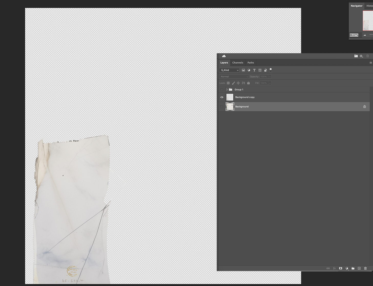
Here is my paper area now with the area that I have ‘swept’ with the brush more solid and the unswept areas more transparent.
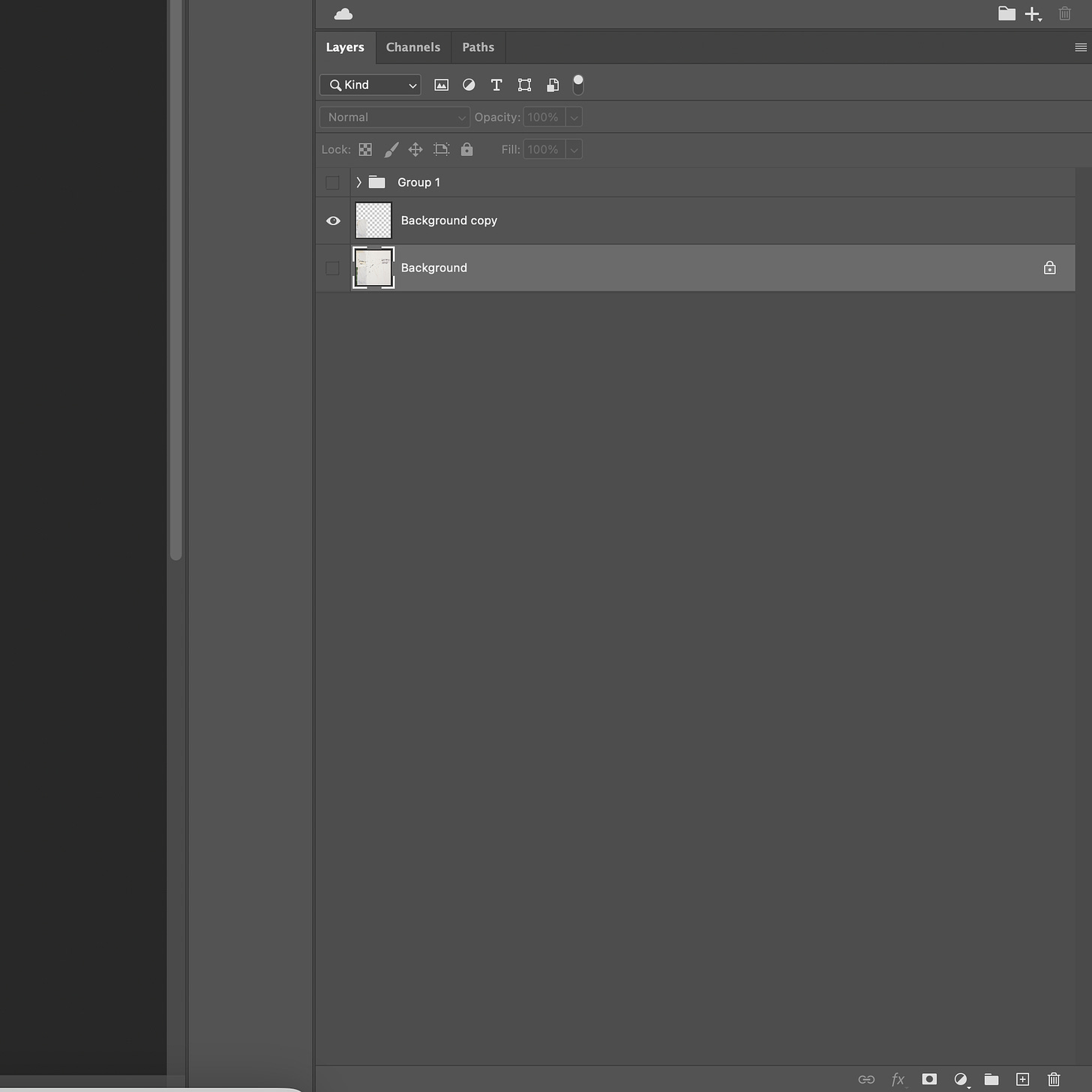
Once you are happy with your selection click okay in the bottom right hand corner but before you do, you might want to experiment with the options in the drop down menu for the ‘output’. This is an instruction to Photoshop as to how you want your selection displayed. For this tutorial, my ‘Output to’ setting was ‘New Layer’ and this means that when I hit okay, the area that I have ‘masked’ will be placed on a new layer above my original background paper.
Don’t panic of your background paper disappears!! I don’t know if it’s just a setting on my Mac, but after this step Photoshop always ‘hides’ my background paper! Just toggle the little checkbox to the left of the layer so the ‘eye’ is visible again and you’ll be able to see your layer.
Before I toggled the visibility on the paper layer this is what my canvas looked like with the new masked area visible on it’s own. Can you see how powerful this is now, ready to re-colour, or available as a clipping mask for papers (journaling stamps) and photos etc.
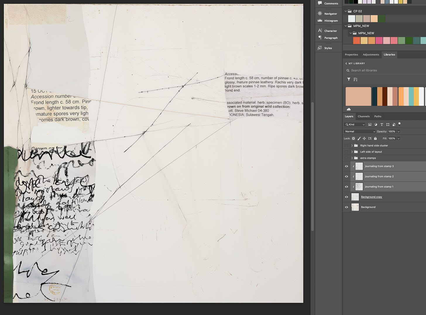
Now I’m ready to make my background layer visible, position my stamped text where I’d like it ‘clipped’ to the ‘mask’ and simply clip it. Once you have the position of your text or stamp in place, and ensuring this is your active layer in the layers toolbox AND ensuring it’s sitting above the ‘mask’ layer, either right click on it and select create clipping mask or select create clipping mask from the layer menu.
I decided whilst creating that I would like more text visible on this paper snippet so I duplicated my text stamp twice and had two parts of clipped to mask where the text was really big and then I scaled the journaling stamp down and clipped it nearer to my photo or newspaper cutting.
I then finished my page with more stamps and a few light embellishments and it’s done!
I just love using my own scrawly handwriting as a design element by stamping journaling in a large size and clipping it to a small area. It’s also a really sneaky way of adding very personal words and journaling to your page without anyone knowing what it actually says and just looks like grafitti ;)
I hope you’ll experiment with this technique and will learn to love it like I do and I’m sure you’ll find your own little routine way of working with it and in no time you will be customising and stretching your stash and having lots of fun!
Please reach out to me if you need any help or have any questions!
Consider purchasing ‘Growth Can Be Hard’ by Rachel and Lynn
If you’d like to use the artwork featured in today’s tutorial you can purchase Growth Can Be Hard from Oscraps.
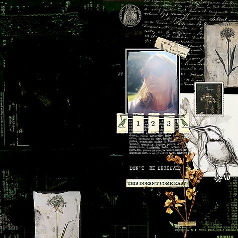
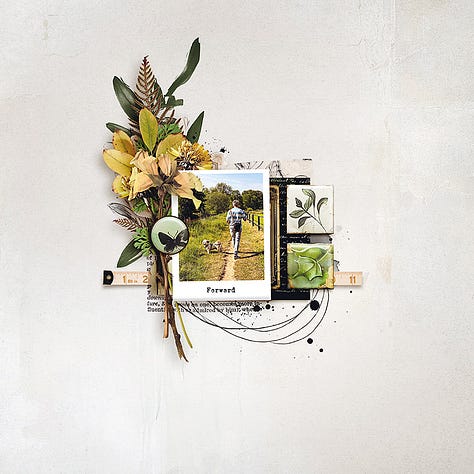
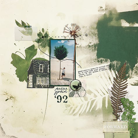
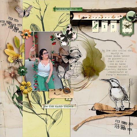
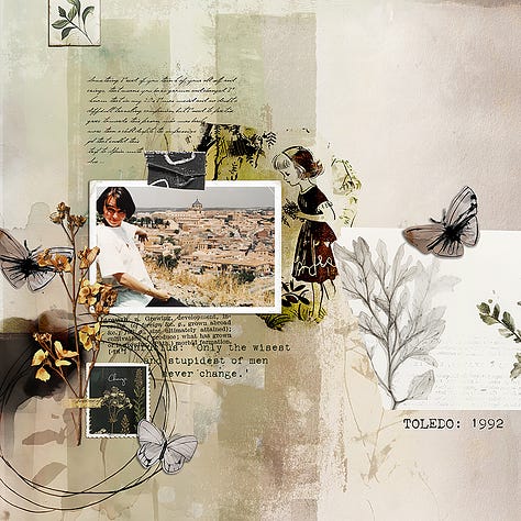
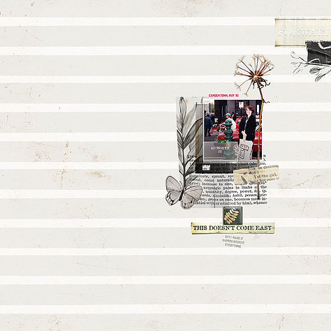
Here are some more layouts from the talented Lynn herself and Aly and Ferdy from my Creative Team.
Also available . . .
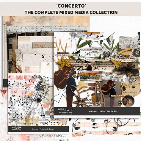
If you like Digital Collage, you might also like my New Paper Pack from Oscraps which was made to match my Concerto Collection that released in January . . .
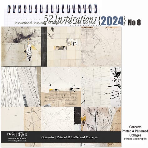

You can purchase the New Papers as-is or they can also be purchased as part of the 52 Inspirations Subscription at Oscraps. More info in the product description of the new paper pack - ‘Concerto’ Printed and Patterned Collages’.
Connect with me
Please, don’t hesitate to contact me with questions or if you have any problems with anything.
And as always, if you have a substack account I’d love if you would log in and leave me a like or a comment. It helps me to learn which content and products you are enjoying and motivates me to keep writing and in turn to put together articles that are a good fit for you.
I’m always open to questions or suggestions!
If you don’t have an account yet it’s free, quick and easy to set up and you can also download the substack app which is lots of fun to use and a handy way to keep up with everything that’s going on.


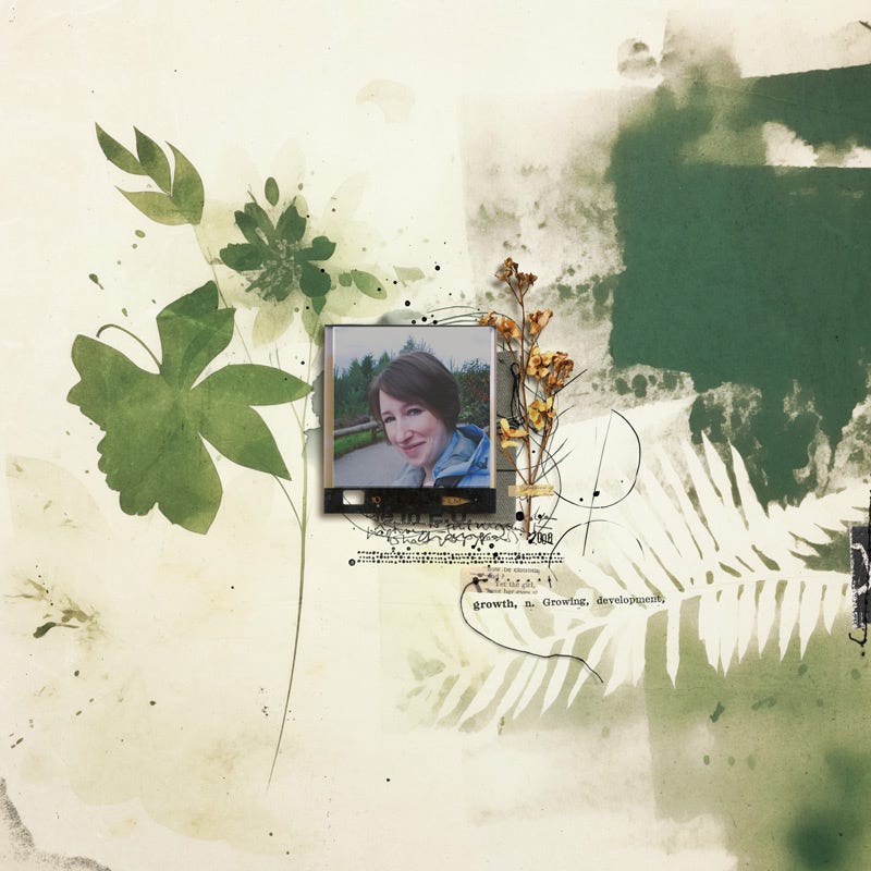


What a great idea to make a digital stamp of your own journaling!