I’m back with some quick tips to speed up your creative process and in turn I’ll teach you how to get more out of your digital scrapbooking stash.
Unexpected Blending Tools
If you want to blend photos or papers, or even create your own Mixed Media Elements to bring a new vibe to a page you don’t need fancy tools or design knowledge.
Grab a large artsy overlay or image transfer type element from one of my Hear My Voice Mixed Media Element Add On’s or a pack like my Messy Bits from This Winter’s Love that released yesterday and just experiment with using the elements as clipping masks.
Simply place your photo, or paper or ephemera above the artsy object you are going to use as a ‘mask’ (think of it like wrapping a gift in tissue paper, the gift itself, the object will be your mask, but once it’s wrapped in tissue it’s appearance will have changed).
Now, with the layer active that is your photo, or paper or ephemera, right click and choose create clipping mask, or if using the menu, Layer > Create Clipping Mask
Your photo or paper or ephemera will now be ‘clipped’ to the mask.
Don’t stop there though, because the results can be adjusted further by changing the opacity option on the mask itself or by altering the blending mode on the mask itself.
This is important if realism matters to you, as your masked photo, paper or ephemera may just look flat and unrealistic if it doesn’t look as though it blends into the underlying background paper.
We want to make it look as if it was always there . . .
Another tweak you could make is to duplicate the base paper that’s underlying the mask and using it to bring texture through the layers. Just position the duplicated paper above your finished masked photo and clip it to your masked photo. Adjust the blending modes and/or opacity to bring the base texture all the way through.
This will result in your photo really looking as though it was rubbed into, or painted into the original base paper.
Examples of using this technique
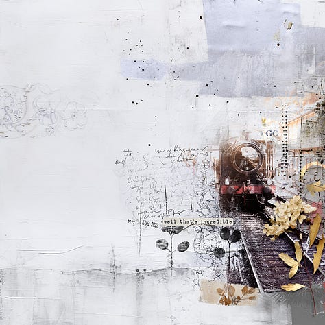
I created an artsy train layout using the new Hear My Voice Renewing Kit and applied these exact steps.
Clipping my train photo to an element from the Renewing Mixed Media Element Pack and then adjusting the blend modes in Photoshop on the mask layer to Darken to blend it into the background paper.
It was almost good, but I still wasn’t quite happy with the results, and in this case actually used a further step by duplicating my masked photo, desaturated it and then changed the blend mode to soft light to give the photo layer a little more ‘pop’.
Can you see the little subtle artsy word GO on the top right of the train?
That’s not included in the kit in this variation, I used the same technique described above to create that element and make it look like something new. Before, it was a traditional word bit element from the Kit. After i clipped it to a textured stamp, it looked like a brand new element. I then adjusted the colours so it was a bit brighter and an off white, duplicated it, and then blended it into the background design by using a lighten setting and then a hard light setting on the duplicated element above it.
Create stamps from elements
To finish my layout, I used a technique that I’ve talked about before where I create digital stamps from elements. I created stamps from a transfer for the black botanicals and I also created a stamp from a photo of my handwritten journaling, you can see this blended into the background design.
I’ll re-cap the process here about making stamps and then will link you to a short video that I shared recently that shows the steps in Photoshop.
This is a technique I use on a frequent basis and if this is a new to you technique you are going to find it so handy!
This works best on elements that are not so dimensional, think a paper strip that has a bold pattern on it, a piece of ephemera with numbers and letters, a mixed media ready made transfer that has paint and marks and maybe text fragments or like a referenced above, even a black and white photo of notes or journaling on paper.
You are going to desaturate your element (in Photoshop that’s Image>Adjustments>Desaturate from the menu) and then we are going to try and remove all of the grey areas and make them white and make any remaining black marks darker.
To remove all of the grey areas and make them white and make your blacks darker we’ll adjust the levels. (in Photoshop that’s Image>Adjustments>Levels from the menu) You’ll see three little nodules/sliders, the far right one is your white, the middle is your grey and the left is your black.
Move them around to make any grey areas as white as you can and any remaining black areas as dark as you can so that your element looks like a monochrome stamp.
Now with this layer active in the layers palette change the blend mode to Darken. This will remove white areas and leave the black marks behind giving the illusion of a black stamp!
In the video, I’ll take this a step further and show you how to create a transparent digital stamp.
Digital Art for Sale at the LilyPad
If you found these hacks useful and would like to support my small business you’ll find my whole catalogue of products available here.
Other Page Design Ideas
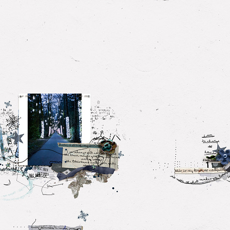
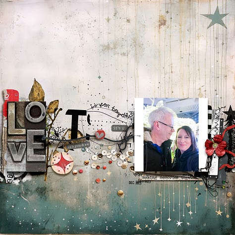
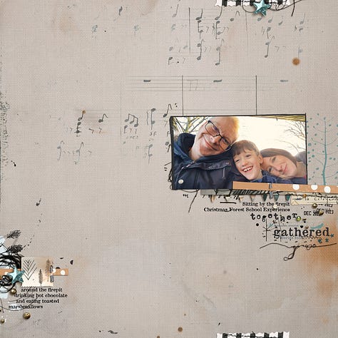
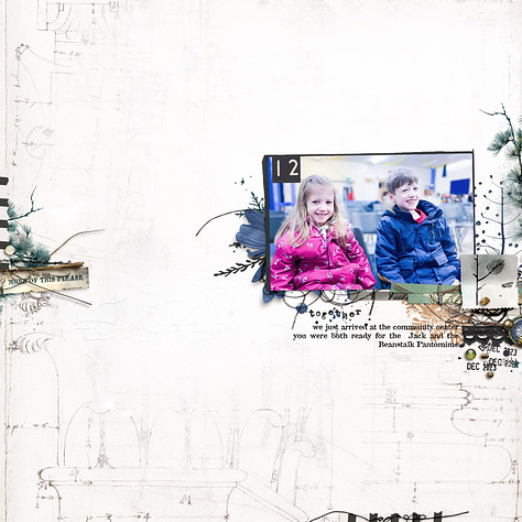
I’ve created quite a few new pages lately, if there’s other techniques or layouts that you’d like me to walk you through please reach out to me and let me know :)

Connect with me
Please, don’t hesitate to contact me with questions about any of my products or if you can’t find what you’re looking for or if you have any problems.
I’ll be back again through the weekend with more beautiful Page Design Inspiration and hopefully some more useful tech hints and tips.
And as always, if you have a substack account I’d love if you would log in and leave me a like or a comment. It helps me to learn which content and products you are enjoying and motivates me to keep writing and in turn to put together articles that are a good fit for you.
I’m always open to questions or suggestions!
If you don’t have an account yet it’s free, quick and easy to set up and you can also download the substack app which is lots of fun to use and a handy way to keep up with everything that’s going on.



Hi, Rachel - I know you're busy with MOC, so this can wait until you have a moment.
I've used the "clip things to whatever" (mask, base paper, element etc.) technique a lot, but as you point out in the first collection of bullet points, it can go "flat" because you lose texture. In my specific effort tonight, I had a construction paper heart that was folded, so there's texture in the paper and the fold. I clipped a colored element from a kit to it, because it was a hexagon and I wanted the heart. Then I duplicated the heart and placed it on top of the clipped items and clipped *that* - now I've got the texture, lowered the opacity to about 50% - so far so good.
But the heart was (predictably) red and I have a pink and gold, instead of white and gold, element in the end. Is there a satisfactory way to lose the pink tone from this equation? Colorizing doesn't help as it flattens the image (I'm in PSE20). Or am I asking too much of the technique or my tools?
I keep thinking there's a work around, but I haven't stumbled upon it yet! Thanks!