A mixed media twist doesn’t have to be complicated - it can easily be incorporated into the skillset that you already have and add a fun new dynamic to your existing scrapbooking style.
I like to look at it as a fun way to add additional texture and interest to your background which can support your compositions in a powerful way.
I’ve been asked before to explain how a ‘clean and simple scrapper’ who enjoys using negative space in their page design can start adding a Mixed Media twist to their layouts and projects.
The term ‘white or negative space’ is commonly used in our scrapbooking community when referring to the ‘empty space’ on the canvas, i.e the space that hasn’t been filled with photos or design elements.
Even though I love messy, I find myself scrapbooking in this style more and more.
Article Links for working with Digital Mixed Media Supplies
Learn how paint and other Mixed Media elements can help to extend your lines and support your composition in this post, this will help you immensely if you are clean and simple scrapper who wants to incorporate more Mixed Media into your compositions
Ready Made Mixed Media Elements can support a very fast ‘drag and drop’ style approach to digital creating - this article also helps with composition when working with Ready Made Mixed Media Backgrounds
What type of elements are good to start experimenting with?
Text fragments are great as they don’t need adjusting or shadowing and can just be placed behind photos or paper layers or clustered elements to add texture
Ready made Paint or Image Transfers don’t need adjusting or shadowing either and again can just be placed behind photos or paper layers or clustered elements to add texture. Bonus tip, if you’re comfortable experimenting with blend modes in the Layers toolbox in Photoshop or Photoshop Elements try tweaking the mode on your ready made paint or image transfer to something different to help blend it into the texture of your background paper.
Other favourite elements that I use over and over that will require some shadowing are ephemera, paper bits, messy threads and stitches, scatters like sequins and the like.
Your choice of supplies will depend on what you are comfortable with in terms of how messy or artsy you want your finished design to be and how many elements your normally add to your page. Maybe try starting small, adding a few ‘new to you’ type elements until you reach the desired look.
Paper Tips
If you are looking to experiment a little with your papers after mostly working clean and simple with solid colour backgrounds but are a little afraid to jump right into a busy ready Mixed Media Background I have some ‘in-between’ options for you.
Working with a ‘simple’ and neutral ready made Mixed Media Background
Consider choosing a neutral colour Mixed Media Background that contains a painted backdrop with just a few marks
Neutral is good, it’s not scary, and you can experiment by bringing in other colours and then if you wish experiment with blending modes for more adventurous looks
Practice with simpler neutral mixed media papers to learn how they can support you with decision making
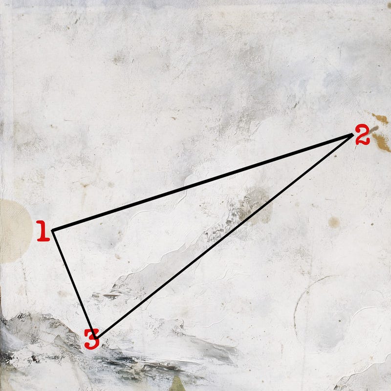
Look for marks or areas of interest within the design that you feel is a good starting point for your focal area, or where a visual triangle (for visual interest) can be developed.
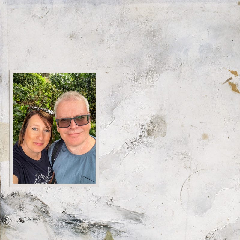
Using this paper as an example, I chose these three key areas of the layout that I felt would create a visual triangle and focused on these areas to build out my design. I will choose somewhere in between these points for my photo placement.
I choose the left side, using the slightly obscured circle to mount my photo.
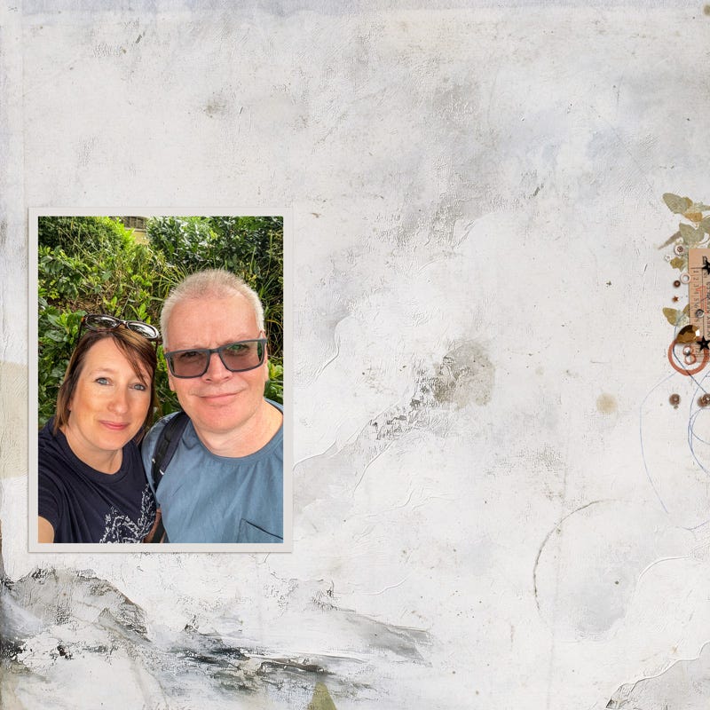
I then move on to gently embellishing the other side of the page (that was numbered as point 2 in what I considered to be my visual triangle). I add some dried leaves, ephemera, stamp and trinkets.
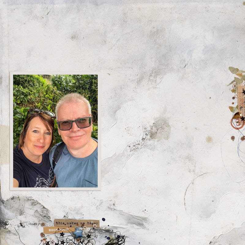
Now I will move down to my final point in what I considered to be my visual triangle to add some interest down there and decide how my page is balanced and what I need to add to finish. It doesn’t need much as the darker painted areas are already adding texture and interest. I add some threads, a paint splatter, more trinkets and some word strips that help to support my photo and story.
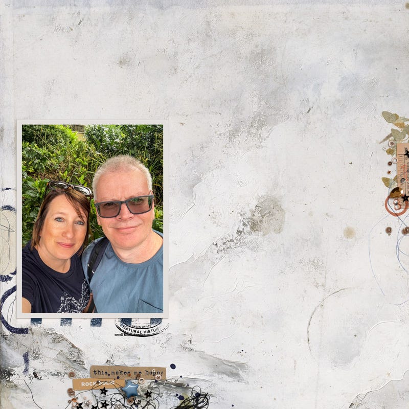
Now I move back to my first point in what I considered to be my visual triangle to add a little something alongside the photo. I decide that I want to draw attention to the photo a little more and choose a textured paint element and adjust the blending mode so that some dark circular stamp type marks are visible along the left. I also add more contrast below the photo with the striped stamp and museum stamp.
Nearly, but not quite done . . too much space between the photo and the bottom point of the visual triangle and too much blank space between the photo and the right hand side of the layout at the other point of the visual triangle.
I add my journaling to fill the first gap, and then I manipulate a different paper from the kit to add the illusion of fragmented text blended into my original paper. I’ll follow up with another tutorial on that in the coming days :)
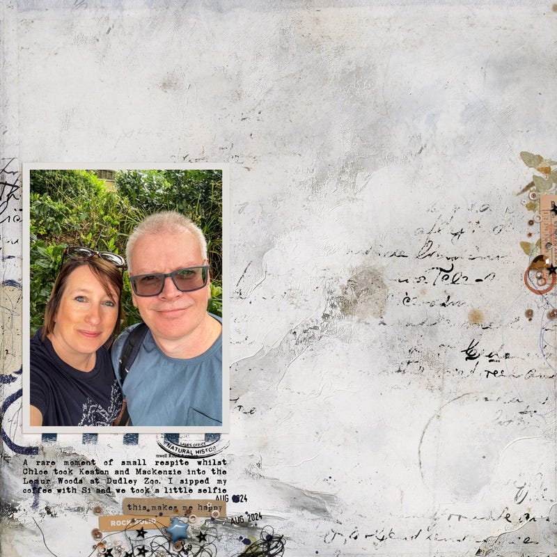
Here is my finished page . . .
Extra Details
The Stamps alongside my photo and under my photo were carefully chosen to match the colours in my t-shirt, this helps the photo to pop out a little more
I re-coloured the little star trinket at the bottom of the page in a light blue to bring through the colours of the t-shirt that Simon was wearing.
The colours in the ephemera and stamps on the right hand side of the page are repeated in the ephemera at the bottom of the page and some stamps on the right hand side of the page are in the same colour’s as Simons shirt.
I repeated some of the same trinkets and sequins that were used on the bottom over on the right hand side.
Applying these paper tips to more complex papers
These same principles can be applied to more complex mixed media papers.
Seek out where your visual points of interest are
Where are there interesting marks that you could connect together?
Where are there marks that could provide a backdrop or mount for a photo?
Are there areas that are highlighted, brighter, or calmer where you could focus on building your design out?
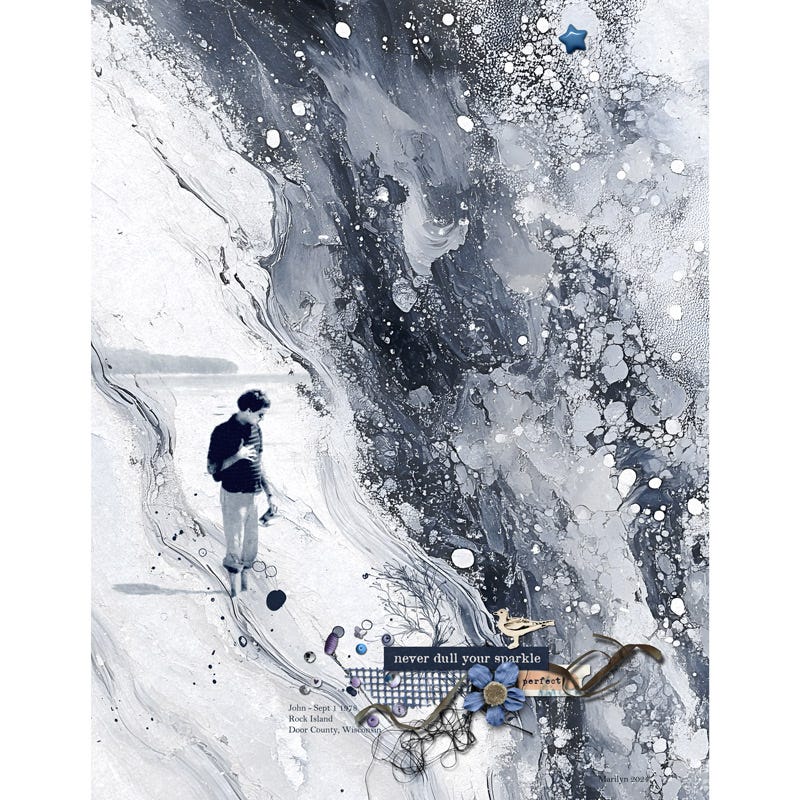
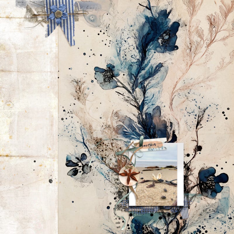
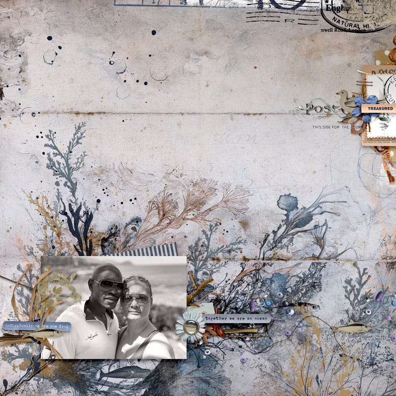
Examples with more complex papers
New ‘Thallus’ Products were used in this tutorial
‘Thallus’ is brand new today to my Oscraps Shop and products start at 50% off but be quick, as this offer is only good through Monday - browse the Collection here.
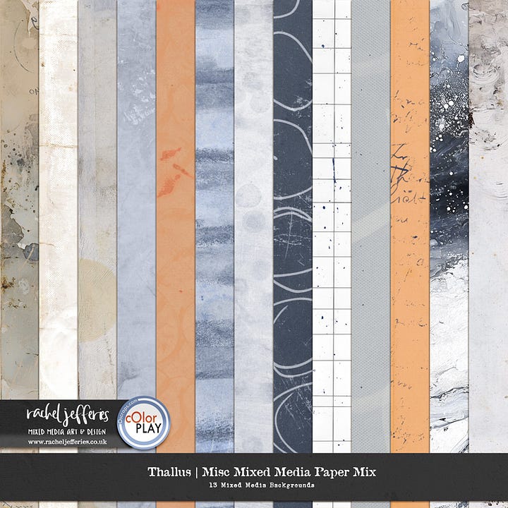
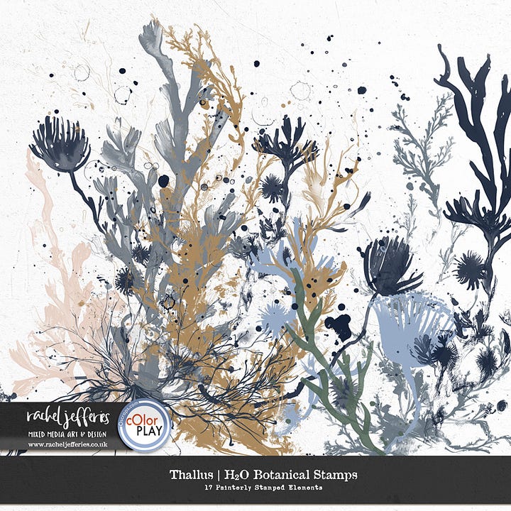
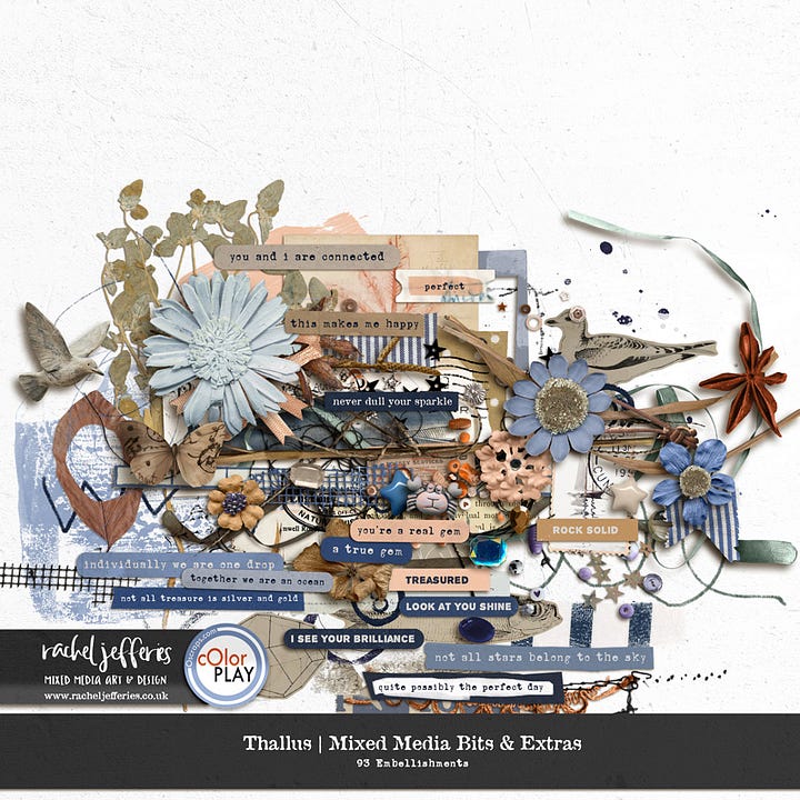
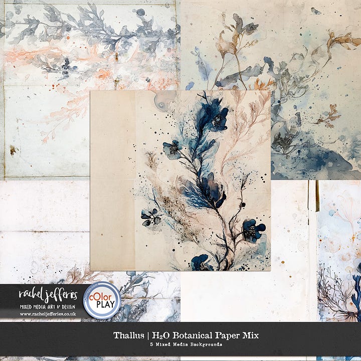
Thallus was inspired by days exploring a piece of pebble lined coastline in the UK
The Thallus Mixed Media Digital Scrapbooking Collection (as in the body of a seaweed plant) brings memories of shoreline treasures that were washed up on the beach during those late summer days.
Download this Mixed Media Digital Art Collection to access beautiful Mixed Media Textures, unique Mixed Media Embellishments and ephemera along with a generous assortment of dimensional pieces to document your own treasure hunts, the gems in your life or your own connection to nature.
Also new this weekend . . .
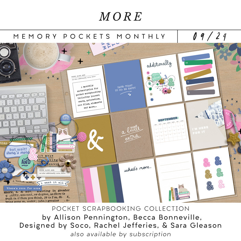
Also new this weekend is the latest Memory Pockets Monthly Collaboration and you can pick this up at 20% off through Sunday :)
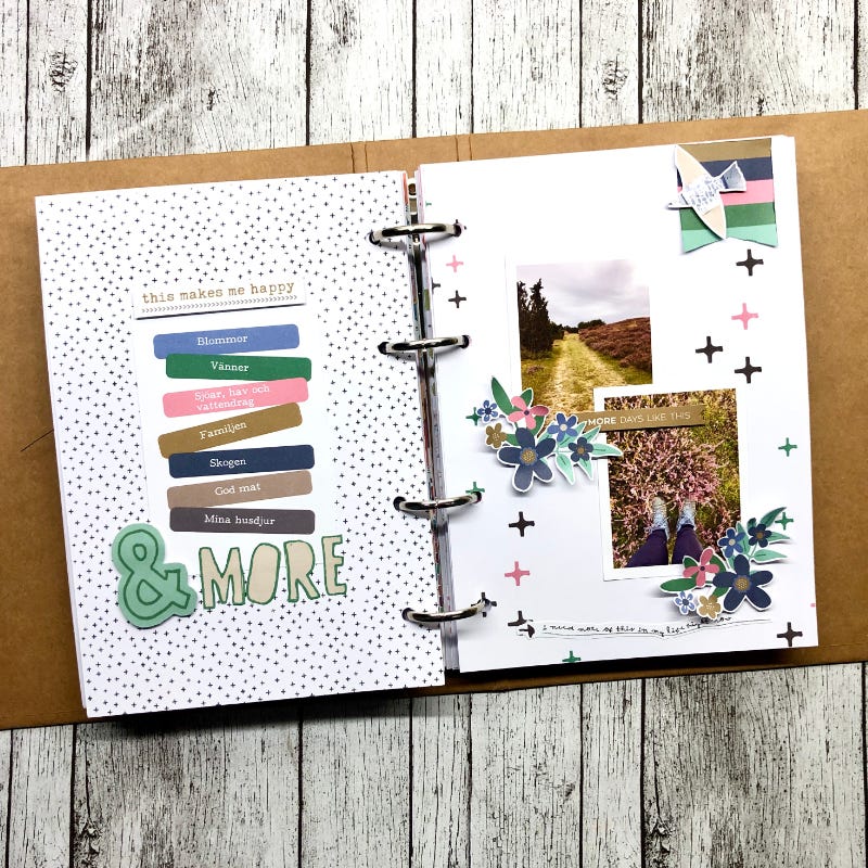
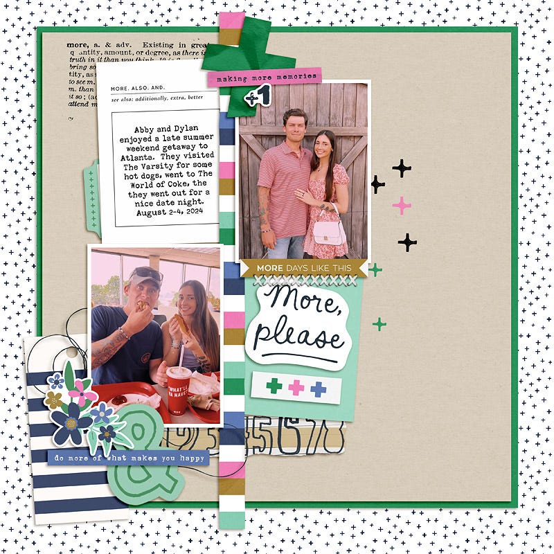
Rooted in the "ands" of life, in extraordinary moments, everyday moments where there is "more to the story", and those moments that capture the beautiful tension where two things are true at once. It has a heart for documenting the details and captions of our lives with an affirming and empowering lens.
Need help with anything else?
If you’d like me to write a specific article or tutorial please let me know in the comments. And as always, if you found these tips helpful, please let me know as it helps to plan future content and encourages me to keep writing :)




Ah, Rachel! Excellent tutorial! And, one of the layouts you posted was featured at Gallery Standouts!